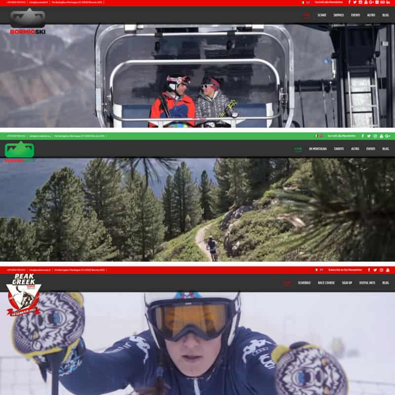
The restyling of bormioski.eu was launched about three weeks ago. The publication of the modernized versione of the company's blog/webiste was just the most recent after the ones in July of peaktocreek.it and bormiobike.eu, both corporate websites.
All those three clearly adopt the same style. They all use a WordPress theme differentiated only in the colors' pick; also they have the same fonts and architecture.

The restyling of bormioski.eu: the reasons why
- Simply it was the time to freshen up. The latest version of the website dates back to 4 years ago. Even though we have been updating the site every year, especially in the design, we have never really worked on the WordPress theme. It was then the right time to adopt a new and more proper style looking to what's trendy in the web space now.
- Usability comes first. The armony with design trends is very important but the capacity of being read everywhere is even more essential. Today's keyword is responsive website, that means it has to be able to adapt on every type of device (smartphone, tablet) with the greatest finesse possibile.
- Must freshen up content: texts and photos. The written work of the pages making up the menu has been parked there for a while. Texts need to get a fresh up every once in a while and so had the photos. The images are the most powerful weapon in the digital communication. New galleries need to come in, always. Photos in the website are a work by: Robytrab, Foto Pozzi, VisualWorking, Fausto Compagnoni, Nicola Bormolini.
- SEO specs. Search Engine Optimization is a fast-moving ground. We always need to look out for that.
The new menu: here you will find everything
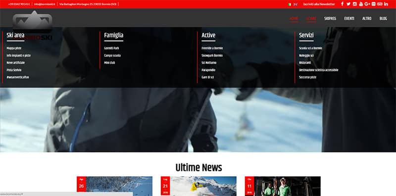
The restyling of bormioski.eu has involved the composition of the menu which has remained well-structured as before. Its complexity is the result of our articulate offer.
The "mega menu" solution gives you the possibility to browse smoothly among pages and find everything you need rapidly.

The blog: the beating heart of the website
The beating heart of the website is the blog which collect all the news from the ski area of Bormio: events, curiosities, important happenings (like snowfalls), prices, offers.
The blog is split in eight categories:
- News from the ski area
- Web news
- Ski deals
- Events
- Freeride
- Night skiing
- Photo Contest
- Bormio Bike
Of course, every article may be commented in the Comment section which you find in the block at the foot of the page.
From the website to the social networks
The blog is the heart of the website because it's telling you all the aspects about the company and what about the social networks? Social media is the organs of our website because it keeps it alive.
The company has adopted several social networks where it has grown its own communities and where the topic of the blog gets analyzed and enriched in content from the shares and comments of thousands of fans.
bormioski.eu: let's share some data
bormioski.eu is a website from the strong winter character, that is obvious. Hundreds of daily visits get counted during the summer and those numbers rise up to thousands during the winter. From December to February the daily peaks may get more than 5 thousand sessions and 10 thousand page impressions.
Considering the last twelve months, 60 % of the visitors comes from Italy, then Czech Republic (9%), United Kingdom (5%), Poland (4 %), Sweden (3 %), Germany, Russia, United States (2 %) and so on.
More demographic data: Milan is the city which brings more visits (26 %) leaving behind all the others. Rome gets second place (5 %), then Como (4 %), Brescia (3 %), Bergamo (3%), Prague (2, 5%) and following all the rest.
Another interesting information is about users' behavior and, in particular, the pages that receive the most page views. The success of the blog is undeniable but the pages that are booming the views are: Info lifts and slopes, Bormio Skipass, Snow report.
At this point of reading, don't leave the website, but continue on browsing among the pages and enjoy the restyling of bormioski.eu! ?
SEPTEMBER 9, 2016
